Documentation
PopupButton
Require: Symcon >= 5.0
Creates a button which, when clicked, opens a popup containing additional form fields.

General Parameters
| Parameter | Description |
|---|---|
| caption | Visible caption of the button |
| download (optional) | (default: "") If this parameter is not an empty string and the output of the onClick script is a Data-URL, the output is downloaded as a text file with the name of the download parameter. (since IP-Symcon 7.0) |
| enabled (optional) | (default: true) If true, the button can be used, otherwise it is displayed as deactivated This parameter has no effect on a possibly opened popup (since IP-Symcon 5.2) |
| link (optional) | (default: false) If this parameter is true, the output of the onClick script is opened as a link. If it is false, the output is displayed as a dialog in the configuration form. (since IP-Symcon 6.0) |
| name (optional) | Name des PopupButtons |
| onClick | Script that is executed when the button is clicked. If the script consists of several lines, the individual lines can also be defined as an array (arrays are supported since version 6.0). It has the same properties as onClick of the Button (since IP-Symcon 5.3) |
| popup | Definition of the popup to be opened (parameters can be changed since IP-Symcon 6.1 by linking the parameter names, e.g. popup.closeCaption) |
| type | PopupButton |
| visible (optional) | (default: true) If true, the button is visible, otherwise it is invisible This parameter has no effect on a possibly opened popup (since IP-Symcon 5.2) |
| width (optional) | Fixed width of the button in pixels or % as a string, e.g. "40%" or "250px". If the value is not set or "", the width is automatically selected based on the caption (since IP-Symcon 5.2) |
Parameters for popup
| Parameters | Description |
|---|---|
| buttons (optional) | (default: []) A list of buttons which is shown in the popup at the bottom right. The close button is always displayed first, followed by the buttons described here in sequence (since IP-Symcon 6.1) |
| caption (optional) | (default: "") Visible title of the popup |
| closeCaption (optional) | (default: "Close") The caption of the close button at the bottom right in the popup (since version 6.1) |
| items | List of form fields in the popup (cannot be changed) |
| Parameters | Description |
|---|---|
| caption | Visible caption of the button |
| onClick | Script that is executed when the button is clicked. If the script consists of several lines, the individual lines can also be defined as an array. No PHP-tags are required. It has the same properties as onClick of the Button. If the script does not produce any output, the popup is closed after the script has been processed. Otherwise the output is shown as a red error message at the bottom of the popup. There is an exception here if the return begins with the prefix "MESSAGE:". In this case the popup is closed and the return is displayed after the prefix in a message dialog. |
| enabled (optional) | (default: true) If true, the button can be used, otherwise it is displayed as deactivated |
Example
{
    "type": "PopupButton",
    "caption": "Open Popup",
    "popup": {
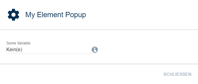
        "caption": "My Element Popup",
        "items": [
            {
                "type": "SelectVariable",
                "name": "VariableTest",
                "caption": "Some Variable"
            }
        ]
    }
}